
This entry was originally posted on Monday, August 27, 2012
If your background appears too vibrant in color and you want to make it recede,
add a thin wash of a complimentary color.
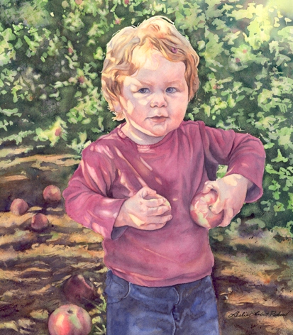
For instance, in the above painting, the foliage behind Quinn was too much of a vibrant green.
It was competing with her and there wasn’t any depth in the painting.
To make it recede, I added a pale wash of red to tone it down and push it back.
This brought Quinn forward more and made her pop.
