
This entry was originally posted on Thursday, January 26, 2012.
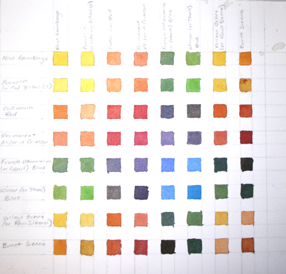
A color chart may seem tedious and boring, especially when you just can’t wait to get to painting, but I find it extremely helpful. All you need to use is the colors in your limited palette. I like the mix up my colors in a mid value range (not too light and not too dark- it is the Goldilocks of watercolor)
For the chart above, I put my colors in my palette across the top and down the left hand side. Then I will begin with pure New Gamboge then I mix New Gamboge with Winsor Yellow (it used to be Aureolin as you can see on my chart). Next I mixed the New Gamboge with Cadmium Red, then with Permanent Alizarin Crimson, and so on and so forth. It is just like a graph. The pure colors are on the diagonal.
The reasons I suggest doing this chart are the following:
First of all, for those newbies out there, it will help you realize how much water you need to add to get a mid value. It is a common misunderstanding when beginning watercolor that it is to be used thickly and straight out of the tube, similar to acrylic or oil. It does need water added to it to get it moving and flowing.
Second, you will see by your mixes which ones you like better and will even find yourself referring to the chart for a certain color as you are learning your palette.
Third, you will get to know your colors very well. You will even start to figure out some of the properties of your paints when you do this.
Finally, you might actually enjoy the meditative state of mixing colors.
